UI Design

March 27, 2008 by Michael

Apple, Google and you:
dummy

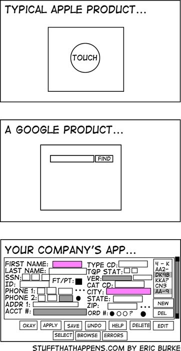
Hilarious, but true. Although being somewhat different and currently under heavy critic (i.e. here) as far as Apple is concert, both Apples and Googles interface designs are appealing, at least to me and the comic summarize this very well: Do one thing and do this well.

The strip was posted here, i found it on this blog

No comments yet

Post a Comment

Your email is never published. We need your name and email address only for verifying a legitimate comment. For more information, a copy of your saved data or a request to delete any data under this address, please send a short notice to michael@simons.ac from the address you used to comment on this entry.
By entering and submitting a comment, wether with or without name or email address, you'll agree that all data you have entered including your IP address will be checked and stored for a limited time by Automattic Inc., 60 29th Street #343, San Francisco, CA 94110-4929, USA. only for the purpose of avoiding spam. You can deny further storage of your data by sending an email to support@wordpress.com, with subject “Deletion of Data stored by Akismet”.
Required fields are marked *